Complete visual identity for a human resources platform

Brand Concept
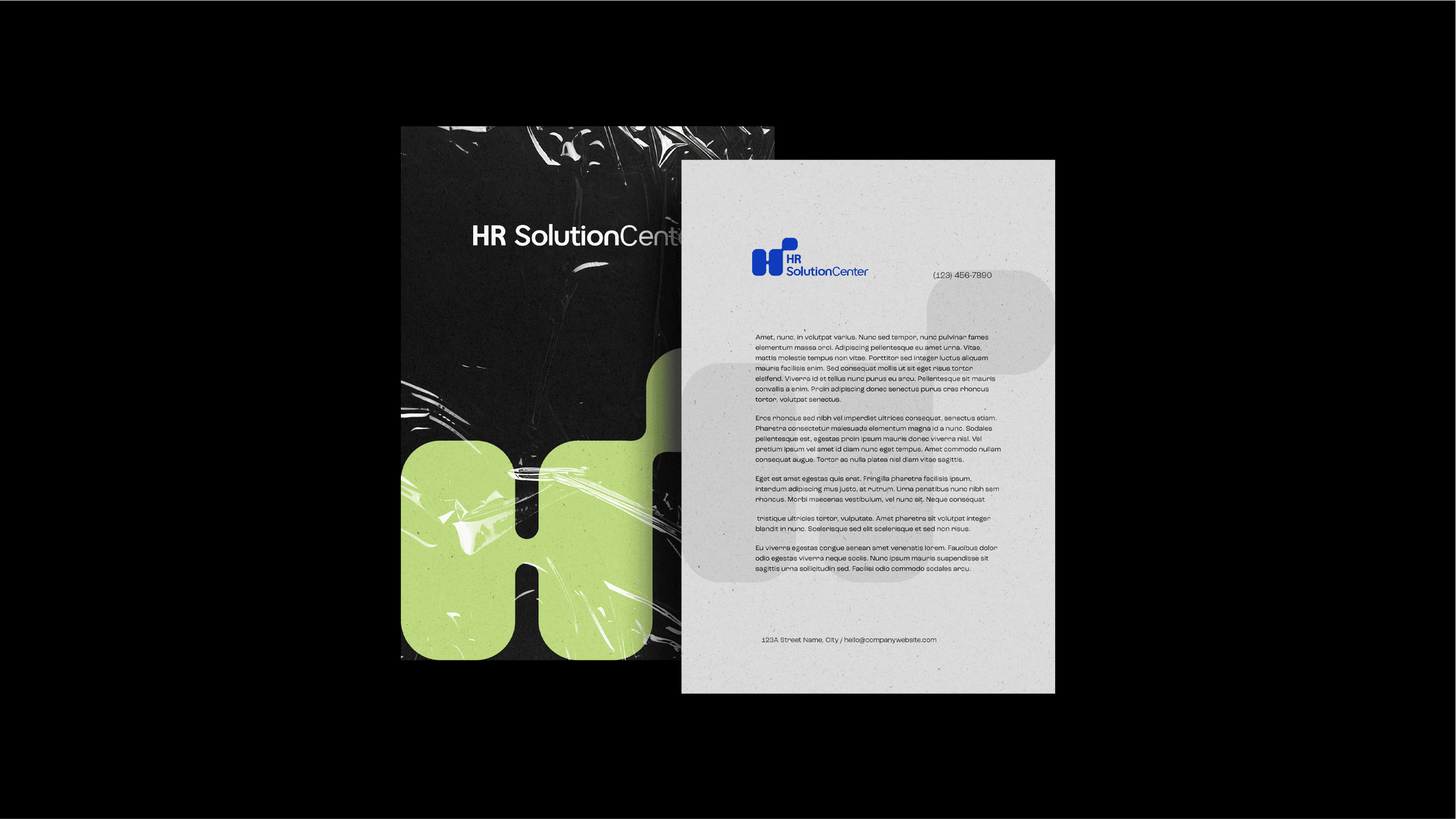
The visual identity for HR Solution Center was designed to represent clarity, trust, and modernity in the human resources field.
The core idea is inspired by the concept of a "mental map" in HR — a visual structure that organizes the many interconnected elements of people management.
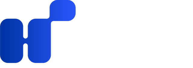
The logo's shape reflects this idea through clean, organic forms that resemble mapped paths, symbolizing guidance, organization, and strategic thinking
(as shown in the PDF's explanation of the mental-map concept on page 5).
Typography and color choices reinforce a reliable yet approachable personality: a deep institutional blue for credibility, a fresh green accent for innovation,
and clean layouts to ensure readability and structure.
The final identity communicates a brand that is modern, trustworthy, and human-centered, ideal for a platform that aims to simplify HR processes while remaining welcoming and intuitive.
Color Palette
Primary Blue
HEX: #0033A1
RGB: 0, 51, 161
Accent Green
HEX: #BDD97B
RGB: 189, 217, 123
Neutral Black
HEX: #000000
RGB: 0, 0, 0
Typography
Primary Font
Gucina
Used for headlines and primary text
Secondary Font
Gucina
Used for body text and supporting content
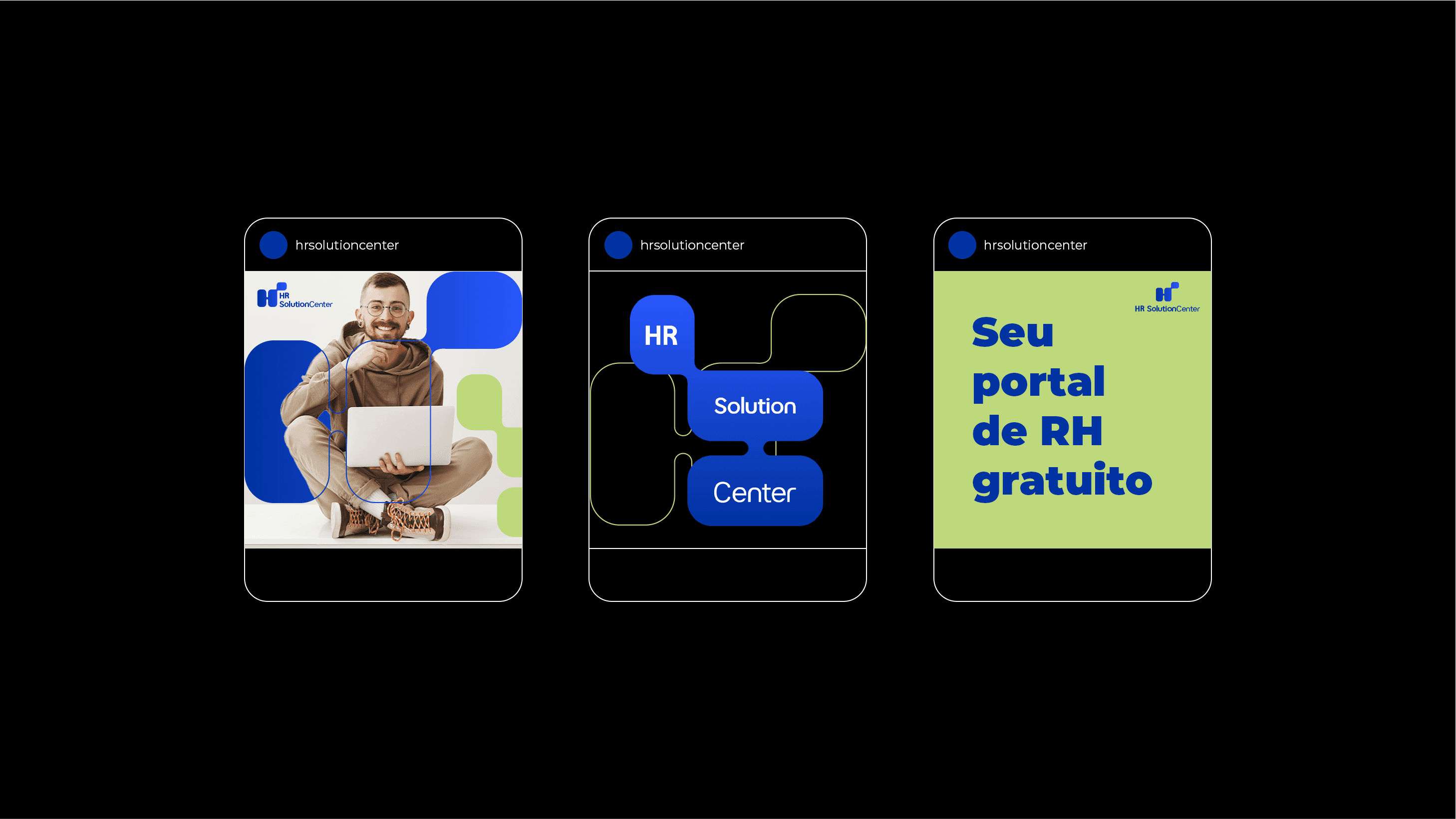
Brand Applications

Ready to Start Your Project?
Let's discuss how we can create a visual identity that reflects your brand's unique personality and values.