
Complete visual identity for a construction company

Brand Concept
The visual identity created for Pires Builders Inc. reflects the strength and trust of an experienced American construction company.
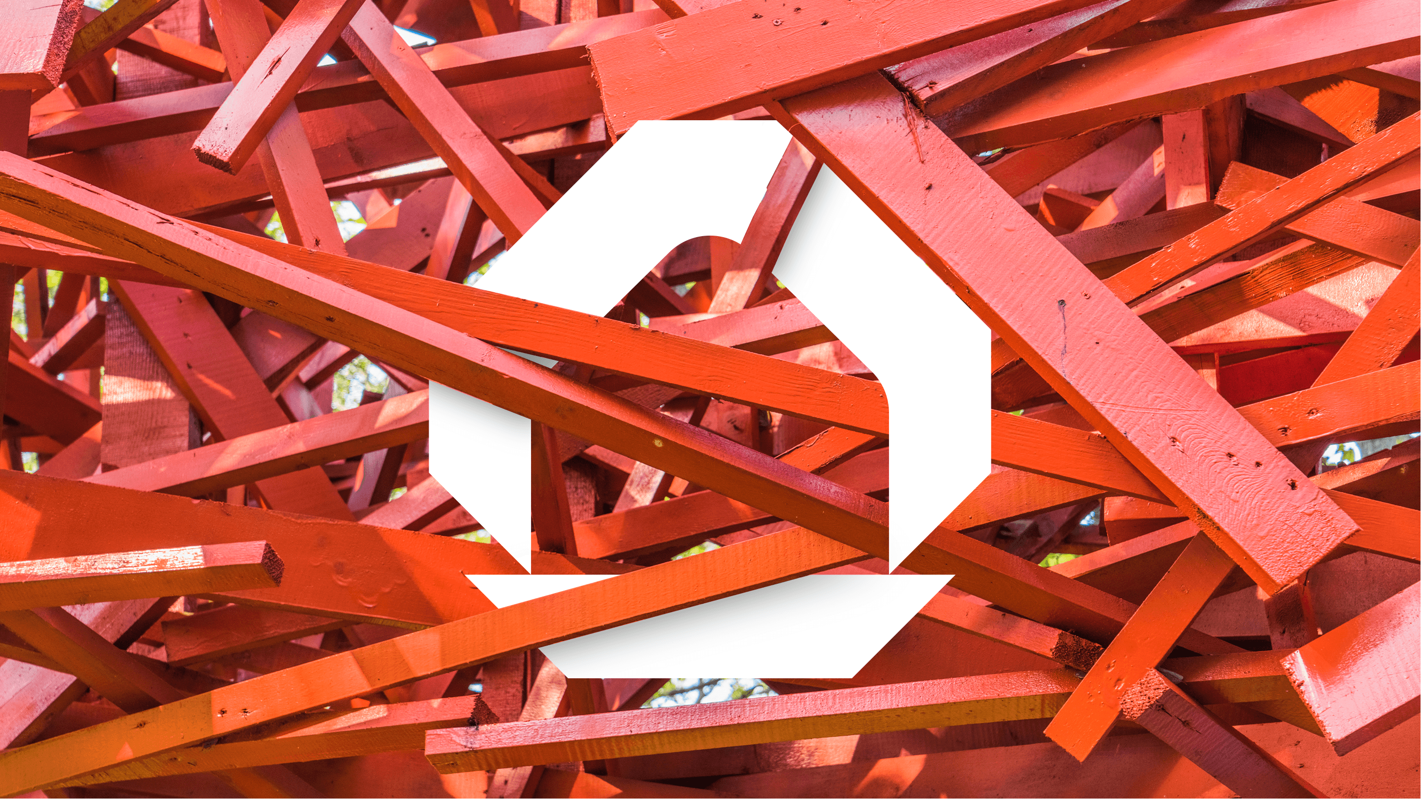
The symbol combines shapes inspired by a house — directly connected to the construction industry — with elements that suggest a solid base
and a safe, well-built structure. Together, they translate the brand's core values: stability, responsibility, and technical excellence.
More than just a striking mark, the identity is designed to visually communicate the sense of security that Pires Builders delivers in every project.
From color and typography choices to real-world applications, the brand positions the company as a reliable reference in quality construction
across the United States.
Color Palette
Primary Orange
HEX: #F2490A
RGB: 242, 73, 10
Deep Black
HEX: #000000
RGB: 0, 0, 0
Soft Light
HEX: #F5F5F5
RGB: 245, 245, 245
Typography
Primary Font
Rota
Used for headlines and primary text
Secondary Font
Rota
Used for body text and supporting content
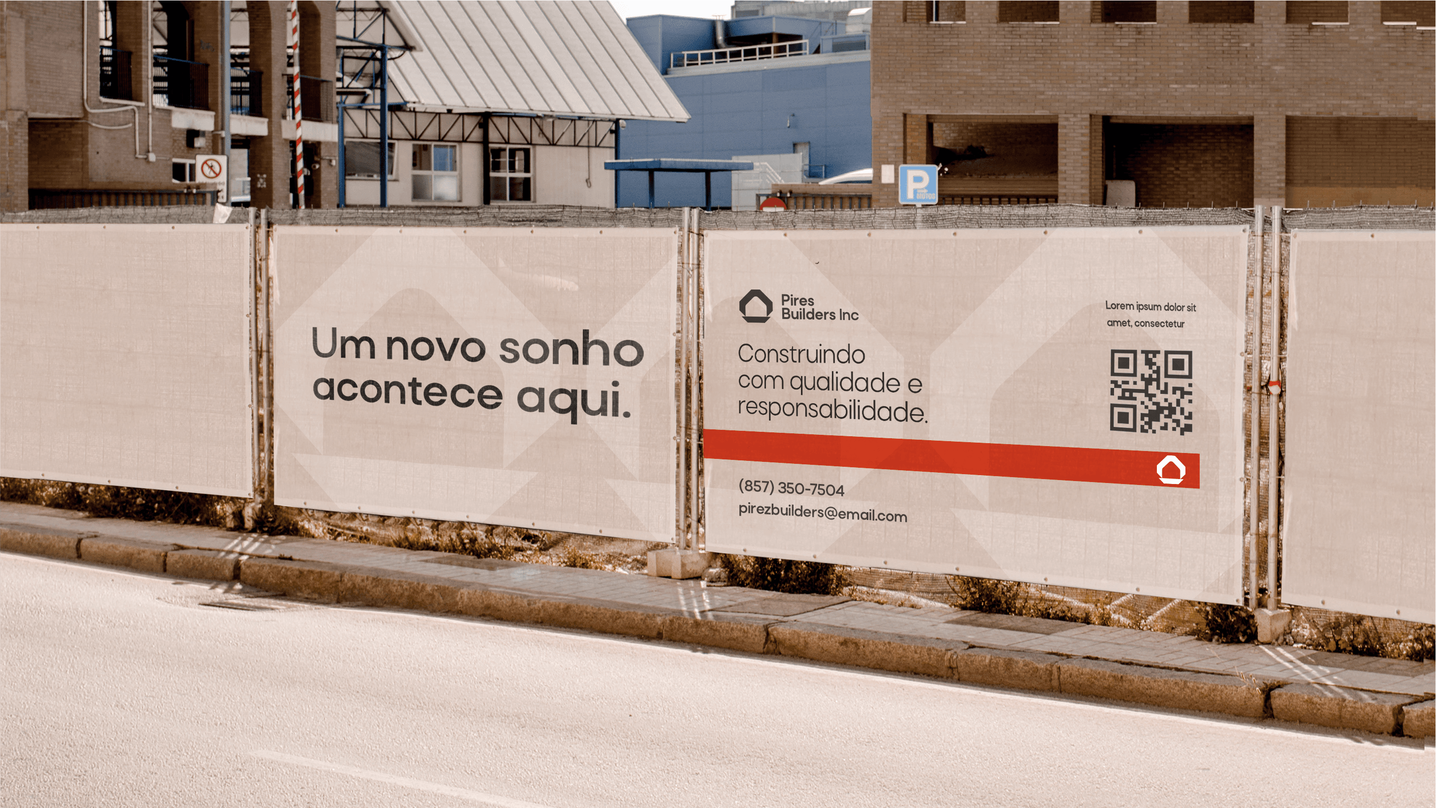
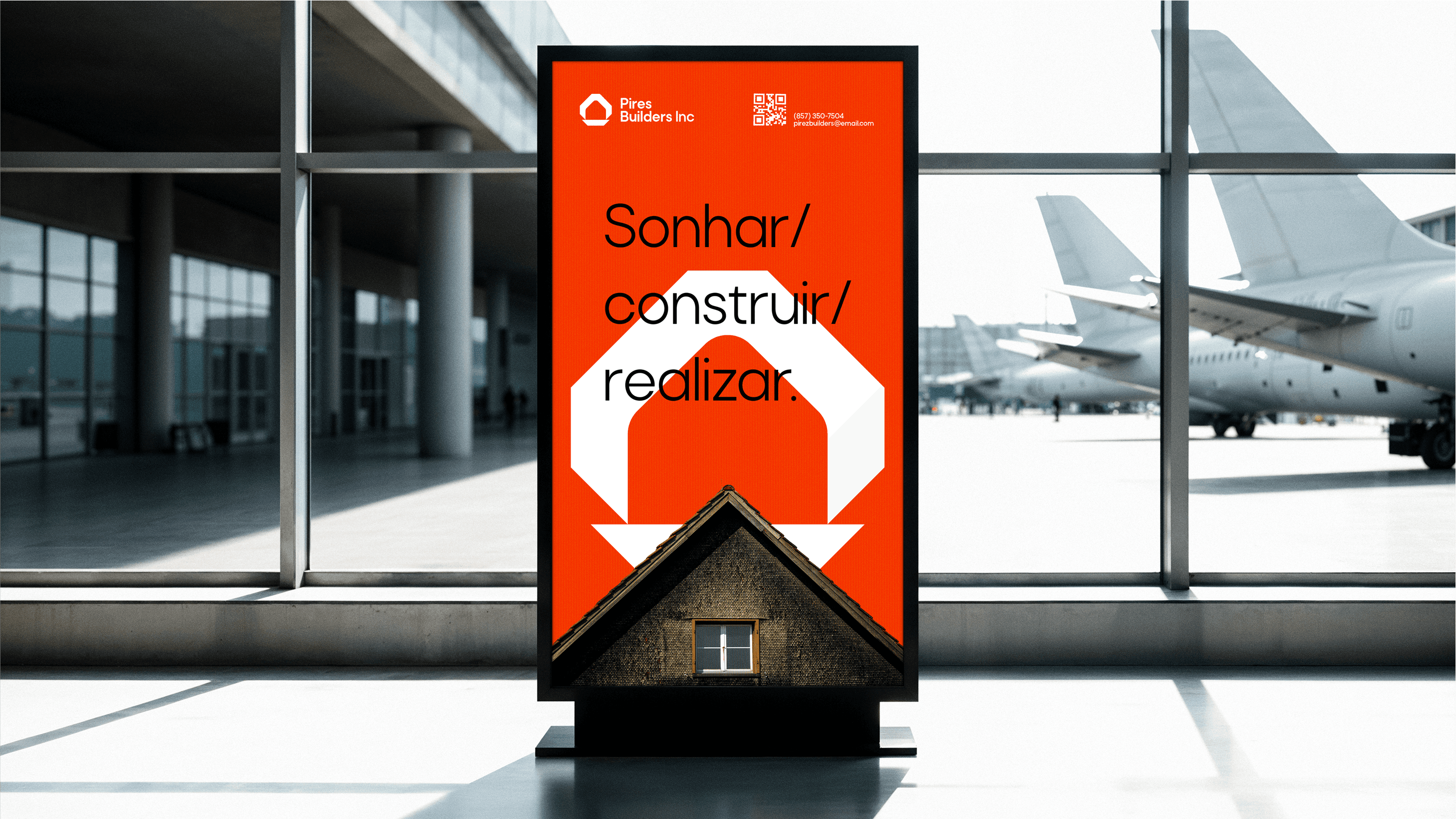
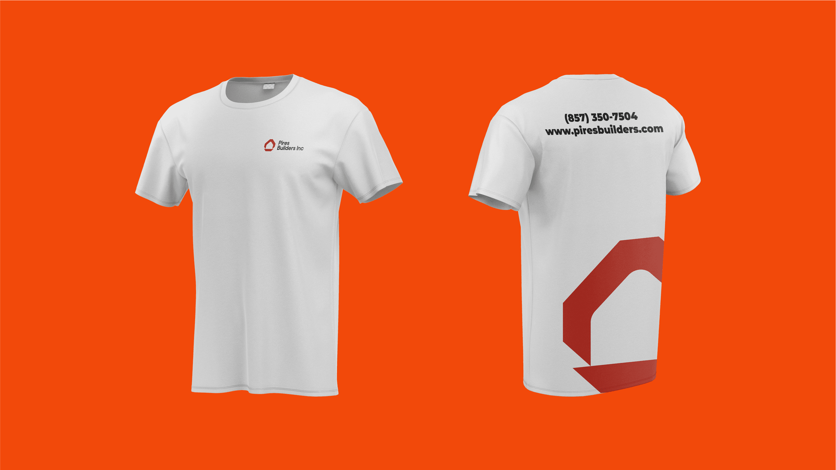
Brand Applications

Ready to Start Your Project?
Let's discuss how we can create a visual identity that reflects your brand's unique personality and values.